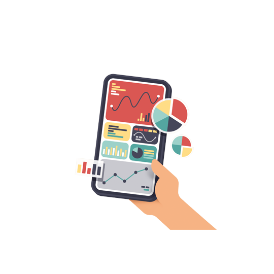
Inflation Dashboard
Inflation rates around the globe are rising. This dashboard, updated daily, gives an overview of increasing prices and other key economic indicators affected by this phenomenon.
In most cases, there are two reasons for inflation. One is that demand is greater than supply. The second is an oversupply of money. The wage-price spiral is a strong driver of inflation.
The opposite of inflation is deflation. Deflation is damaging in cases of overcapacity, but it can also be advantageous if it occurs through increasing productivity.
Click here to explore the latest inflation trends from around the world with GIS’s user-friendly Inflation Dashboard.
Overview
The Overview page provides all of the most important indicators.
Please select a country from the dropdown menu or click on the map to get the latest data. Click on the eraser in the “countries” field to deselect a country.
Table of Contents
- Latest inflation rate and Inflation Meter
- Inflation rate time series
- Categories of inflation
- Public Debt
- Real GDP, quarterly
- Exchange Rates
- Producer Price Index (PPI)
- Policy Rates
1. Latest inflation rate and Inflation Meter
This page shows the latest overall monthly inflation rate compared to the previous year for each country. The historical low and high are also shown.
The inflation meter is divided into the following zones:
- Green Zone: Countries generally try to keep inflation at about 0 to 2 percent.
- Yellow Zone: Inflation is too high.
- Red Zone: Inflation is nearing a historical high, or there is deflation.
Please select a country from the dropdown menu or click on the map to get the latest data.
2. Inflation rate time series
This section provides a detailed view of the historical highs and lows for each country.
Selecting a country from the dropdown menu will reveal the respective time series. Please note that some countries report their inflation rates later than others.
3. Categories of inflation
Inflation is measured in 12 overarching sectors. These categories show which goods and services have increased or decreased in price during the previous year. The bars represent the latest values for each given country.
Clicking on any of the 12 icons will show you a line graph that offers an overview of how the inflation rate of this particular indicator developed over time. Clicking on the icon again or on the arrow pointing to the left will bring you back to the initial chart.
Click on the information buttons below the icons to see what each category’s subcategories are. For example, the house in the middle reveals that costs for water, electricity and gas are included in this category.
Please note that not every country reports on these categories.
4. Public Debt
While most governments typically do not want high inflation, it does have the side effect of making debt more manageable. On the other hand, debt increases money creation and excessive debt is therefore a driver of inflation. However, rising inflation rates are generally also followed by rising interest rates (see 8. Policy Rates).
Public debt is put in relation to the gross domestic product (GDP) of each country, thereby ignoring currency devaluation, interest rates, etc. The result is a good indicator of the sustainability of government finances.
The time series shows how this debt developed. For more on information on how the GDP developed please see 5. Real GDP, quarterly.
5. Real GDP, quarterly
Most commonly, recessions are defined as a fall in GDP for two successive quarters. To better illustrate how a given country’s GDP has developed, the next chart includes a toggle button where you can switch between GDP growth in percent compared to the previous quarter and GDP growth in absolute figures.
6. Exchange Rates
Another indicator for a region’s purchasing power is how well the currency compares to others. A stronger currency makes imports cheaper and can result in low inflation. Even though the Bretton Woods system is no longer in place, the U.S. dollar is still the world’s dominant reserve currency. Therefore, each currency is compared to the U.S. dollar (the U.S. dollar itself is compared to the euro).
A dropping line indicates national currencies becoming weaker over time compared to the dollar, as one would need fewer dollars to exchange one unit of the respective currency. Values below 1.0 consequently mean that the national currency is worth less than 1 U.S. dollar.
7. Producer Price Index (PPI)
The producer price index (PPI) measures the rate at which the prices of producer goods and services change over time. It is a key statistic for economic and business decision-making, and for monitoring inflation. The PPI therefore measures the rate of change in the prices of goods and services bought by producers.
8. Policy Rates
One option for central banks to control rising inflation rates is to increase the level of interest.
Please note that these are monthly data, therefore the latest trends are not always instantly included.